3 Fresh Ideas to Help You Create Innovative Digital Learning
Traditional design approaches can be boring. Bored learners are unmotivated. Why not use some modern technologies to enhance the learning experience?
In this article, we’ll look at three fresh ideas that can make your digital learning more interactive and engaging for the learner.
1. Scrolling: Enhance the user experience
In the past, scrolling was considered poor practice. But, as modern learners have started using smaller devices (phones, tablets), scrolling is making a comeback!
Small screens make browsing multiple pages cumbersome, while scrolling gives a better user experience.
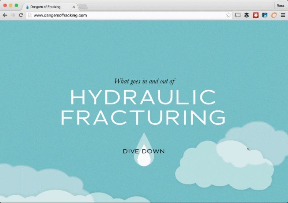
To see what I mean, look at The Dangers of Fracking by Linda Dong. Here all the content appears on one page and parallax scrolling is used to help users navigate through the topics.
Why I like scrolling:
- It saves the user unnecessary steps by including all the information on one screen.
- It gives the user full control of the navigation.
- Scrolling through the content is a journey. Interactive elements, like pop-ups, help the user explore and drill down deeper to learn more about a topic.
- Background graphics are used to create a relevant canvas for displaying the content.
2. Clickable regions: Use them to link pages
Instead of using standard buttons to link pages, consider using interactive elements on top of images. For example, in the OUT MY WINDOW example, a cut-out image acts as a clickable region and links to the additional content (a pop-up layer containing video).
Why I like clickable regions:
- Interactive links help you navigate to each section of the course.
- Image effects (rollovers) are interactive and engage the user.
- A relevant clickable image, or region, is far more interesting than a button with text.
3. Menu navigation: Make it easier to consume content
A user-driven menu design, such as side or top tabs, puts the learner in control of the order in which content is accessed.
Elearning tools, like Elucidat, have ready-to-use menu templates that help you compile interactive menu screens. These menus allow you to link each topic to a relevant part of the course.
Here’s an example of simple menu navigation built in Elucidat:
Why I like menu navigation:
- It is easy to switch to different pages.
- It is simple to create and maintain.
- It works seamlessly across all device sizes: desktop, tablet and mobile.
Stay on top of the latest elearning ideas, trends, and technologies by subscribing to the Elucidat weekly newsletter.
Written by: Steve Penfold
Steve Penfold is Customer Success Director at Elucidat, the simple and intuitive authoring tool. He helps large companies use Elucidat to deliver more effective elearning 50% faster.


