Infographics are everywhere these days, especially in the eLearning industry – there is even an entire website dedicated to them! What is an infographic? Well, it is a visual image such as a chart or diagram used to represent information or data. Designers prefer infographics because they can communicate a complex set of ideas in simple, visual terms. And for readers, they can quickly scan data and research to gain a broad understanding of the material.

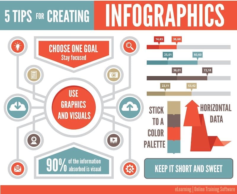
Infographics can easily fit into your eLearning course materials and readers appreciate the change of pace. These are 5 short and simple tips for designing an eLearning infographic.
- Choose one goal. Keep your infographic focused. Don’t try to include too much data and information.
- Use graphics. Up to 90% of the information our brains absorb is visual. Use text to complement your graphics.
- Choose a color scheme. Stick to a three or four color palette for the entire infographic. Don’t get too crazy.
- Keep it short and sweet. Your infographic should allow readers to quickly skim the material and come to a conclusion within 8-15 seconds.
- Create horizontal data. People read and process information from left to right, so the data visualizations should move this direction as well.
What infographic tips do you have? Stay tuned for a list of great tools to help you create yours!
